Genetic analysis tools for the hobbyists
Introducing my GitHub package based on G25 DNA coordinates

I’ve released a package on GitHub with my own R-based code running in Jupiter notebooks that apples a a number of modern analysis techniques to G25 coordinates of historical and modern DNA samples available to the public from scientific sources.
https://github.com/olorin15/genetic-genealogy

Global 25 coordinates from: https://vahaduo.github.io/g25download/

(Originally from Eurogenes — see https://eurogenes.blogspot.com/2019/07/getting-most-out-of-global25_12.html)
Datasets manually filtered by epoch / age (Bronze, Iron, etc)
Additional data comes from
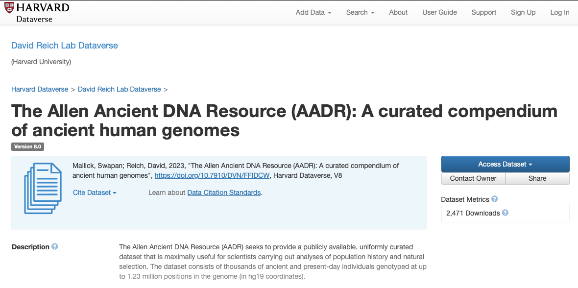
David Reich's Lab at Harvard (https://dataverse.harvard.edu/dataset.xhtml)
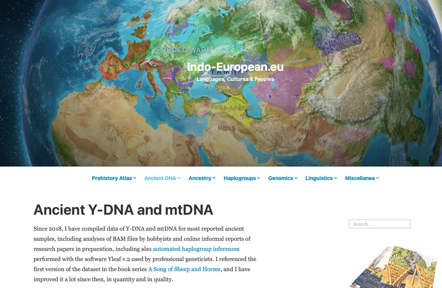
Indo-European.eu (https://indo-european.eu/ancient-dna/)
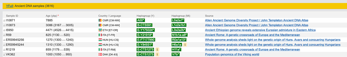
YFull's ancient DNA samples (https://www.yfull.com/ancient/)


R code using Jupyter notebooks includes
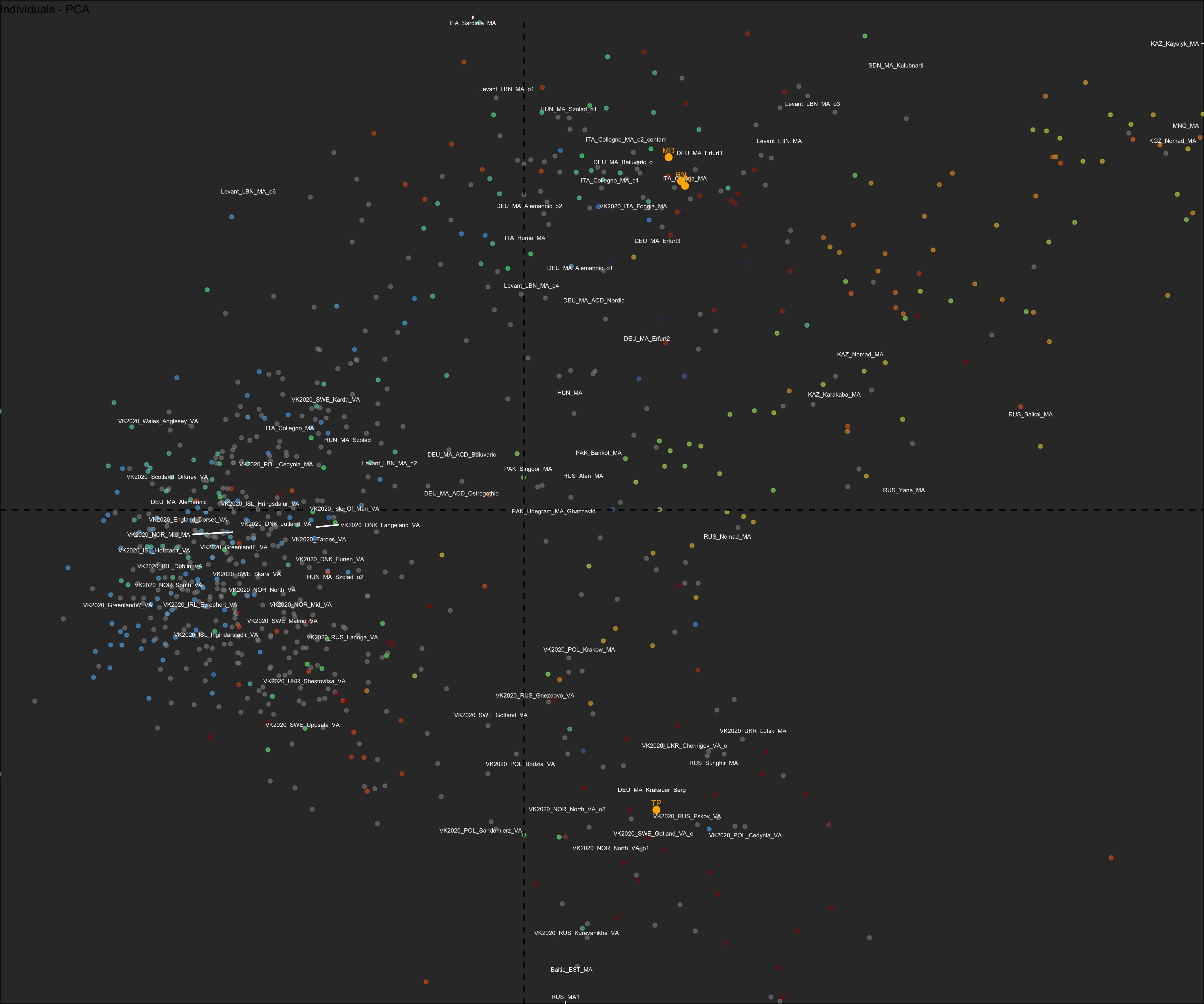
Principal Component Analysis
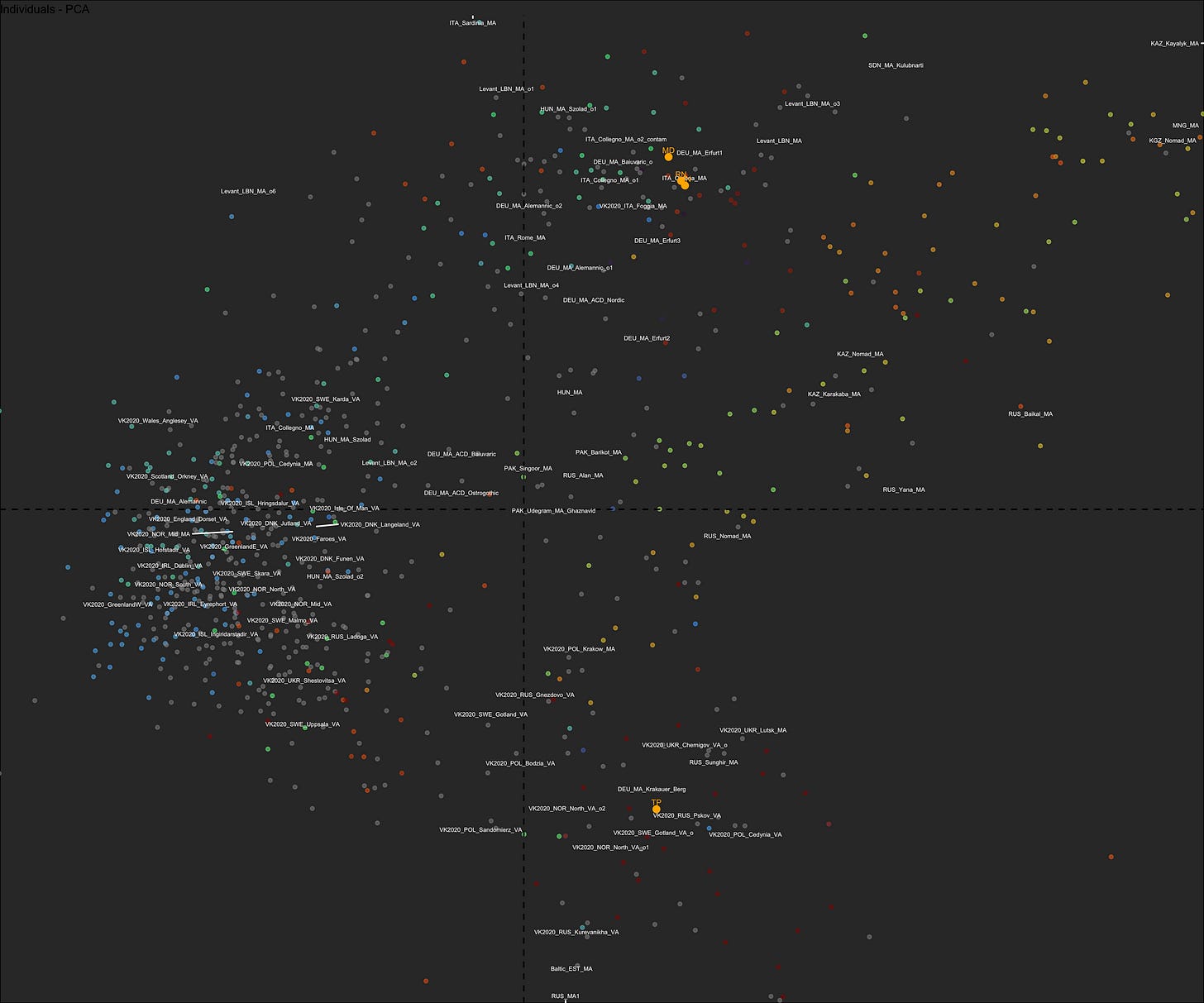
The most widely used approach to look at DNA data, since the original covers millions of dimensions… We reduce the dimensionality to something reasonable, like G25 coordinates, and then look at the main ones in a 2-D projection.
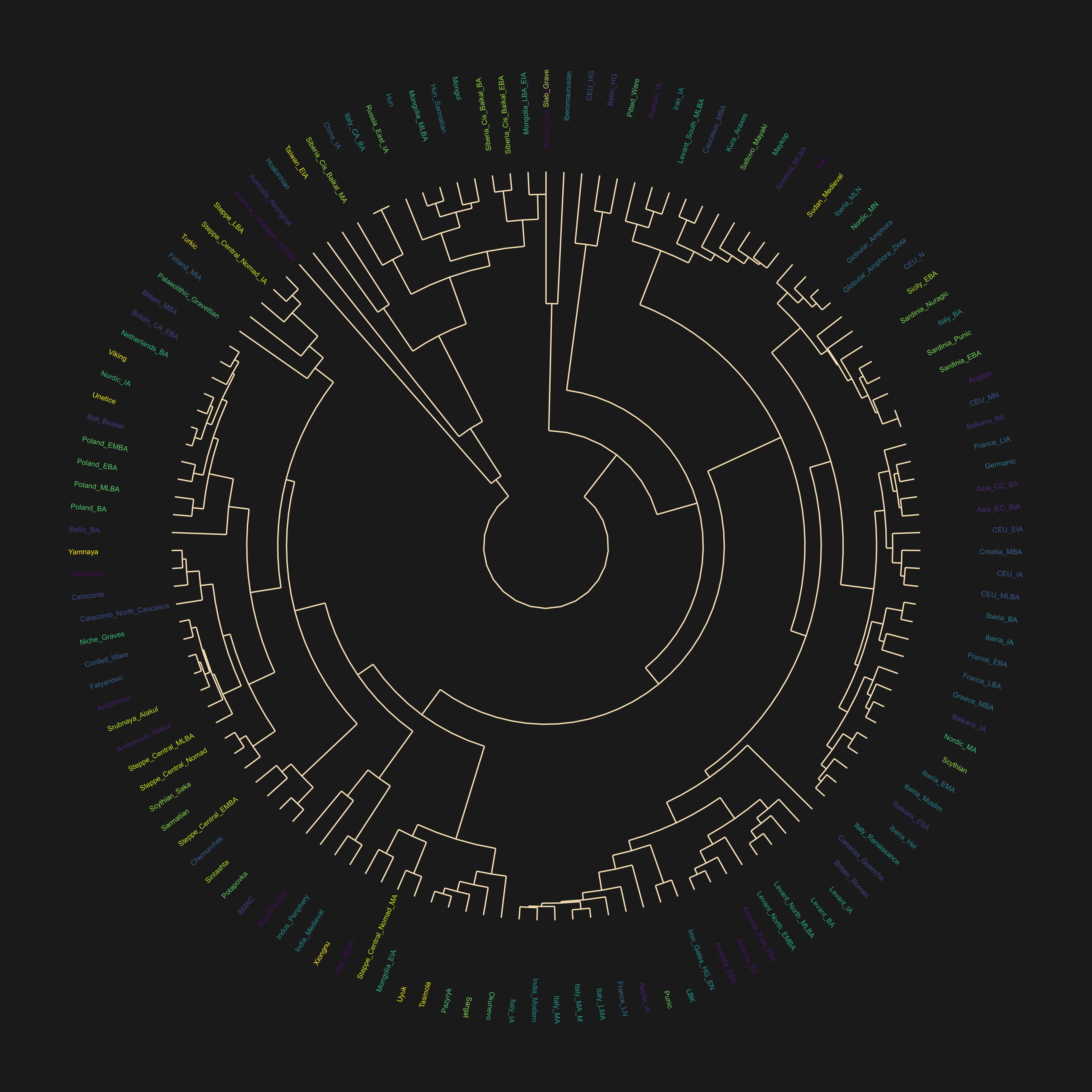
Hierarchical Clustering
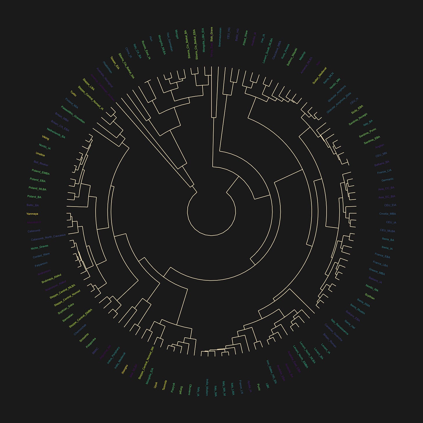
Often applied to animal DNA, but for some reason often overlooked for humans… Get’s really interesting when you plot metadata, such as supposed culture that the individual in question belonged to, Y or mtDNA haplogroups, etc.
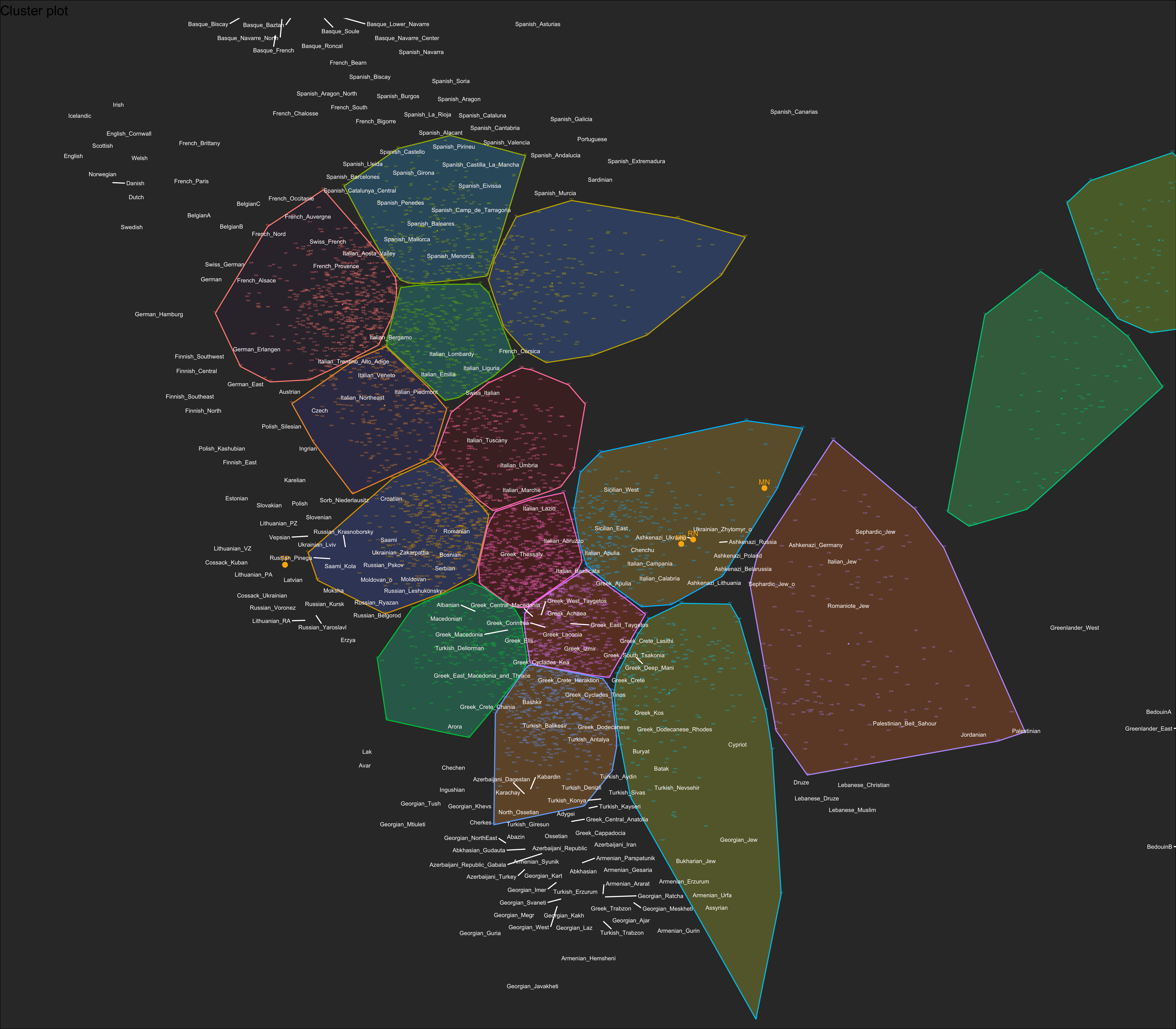
K-means Clustering
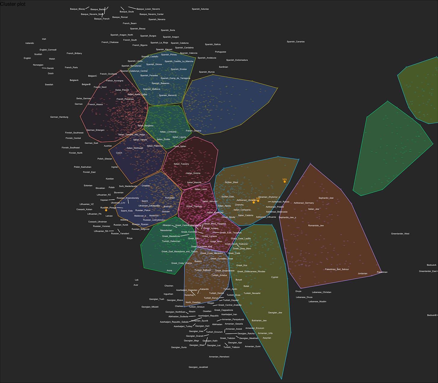
Can be viewed as continuation of PCA or a standalone technique. Is at the heart of genetic Admixture analyses you are used to seeing in the literature, where they cluster the data, find the dominant groups, and model other populations using the averages from those.
Nearest Neighbors
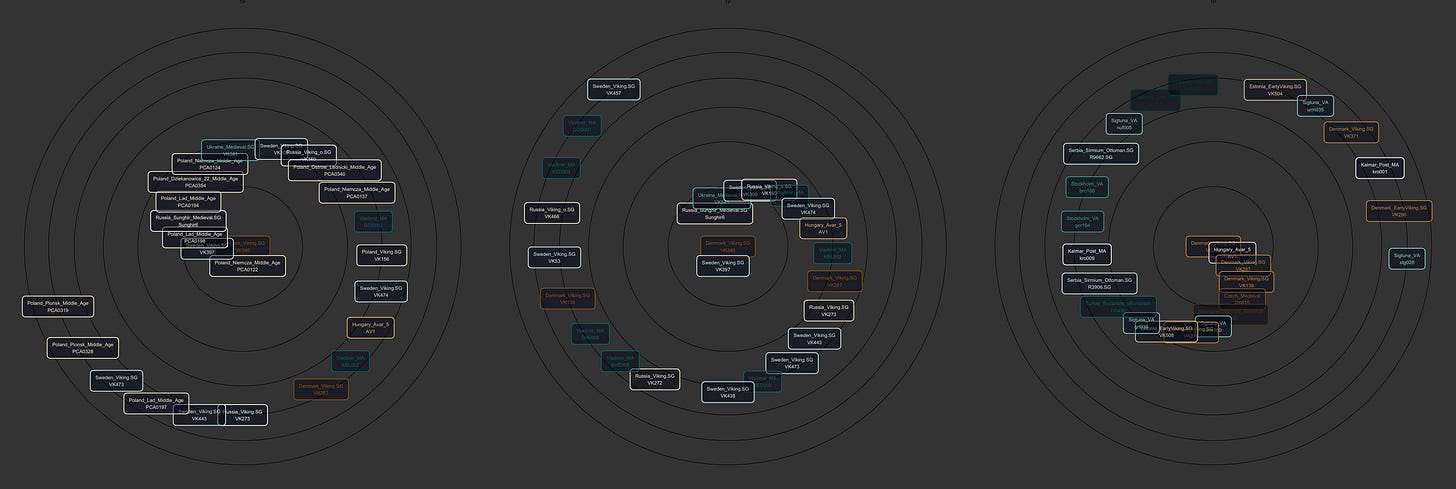
Simple application of k-nn using the distance between points in G25 space, visualized in spherical coordinates as a spiral.
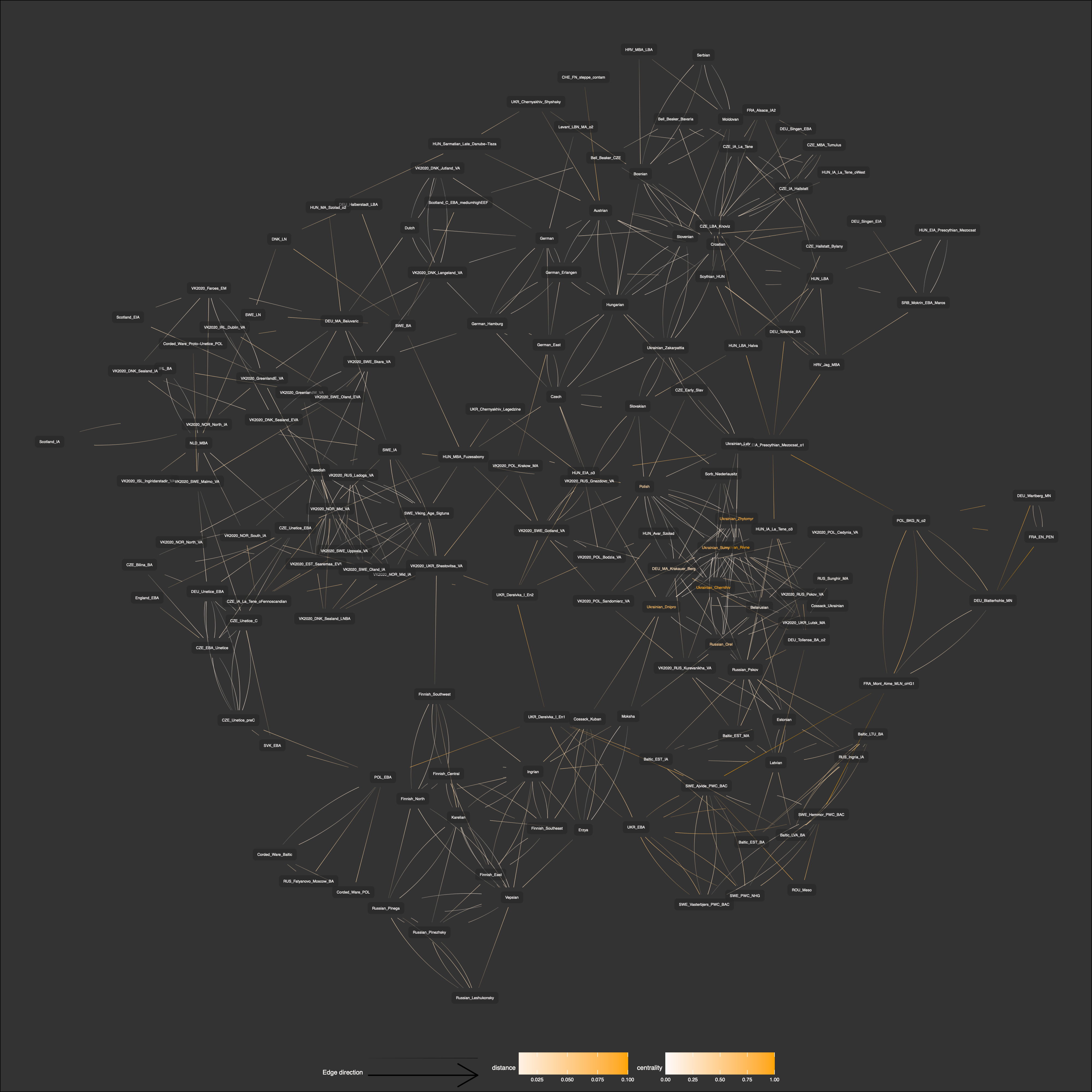
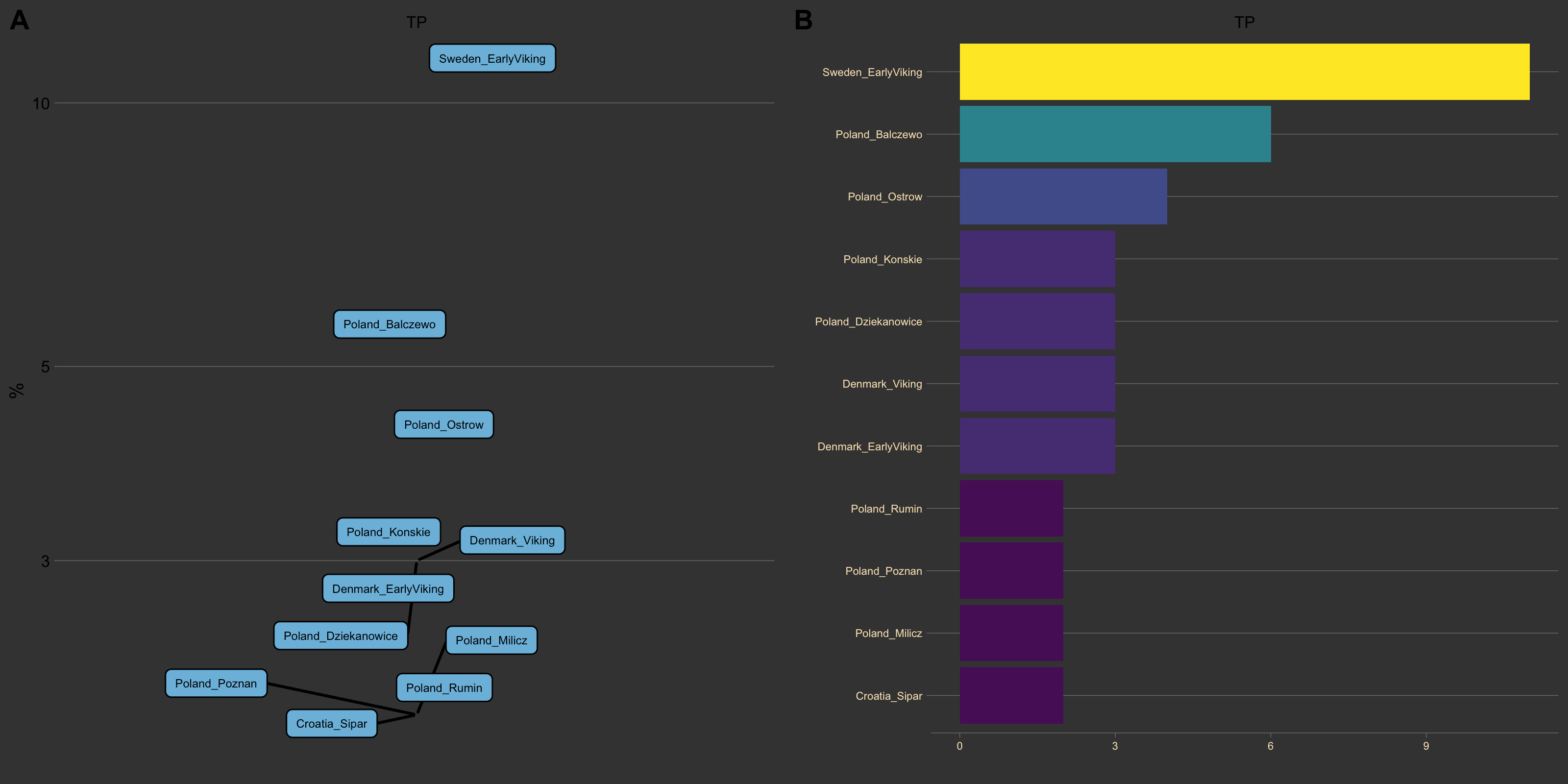
Graph Analysis

My personal favorite — application of graph theory to G25 data. I calculate 5-nearest-neighbors for each DNA sample and create a graph from the data. Then I use centrality measures and all the other wonderful tools graphs bring. The visuals are based on graph subsets, where you pick a sample and build out a network of nearest neighbors, while accounting for connections among them as well. Can be used for clustering, but is possibly the best visualization tool.
XGBoost

This one is unique as far as I can tell. Applying boosted Decision Trees to learn which dimensions appear to predict group placement. Results vary by sample and age… But are interesting and informative, providing a very different view.